Clicking the checkout button on a fun purchase is a great feeling. When customers visit your store, they want a user-friendly experience that leads to an even smoother checkout. The faster a customer can complete their purchase, the sooner their order will be on the way. How can you create the best customer experience and also decrease cart abandonment?
We’re going to take you step-by-step through a successful checkout flow, so your customers can easily purchase products. Say goodbye to cart abandonment and hello to boosted sales.
What is a checkout flow?
All a checkout flow boils down to is the process to purchase a product. From the time customers visit your website to the time an order is placed, they’re involved in a checkout flow. The full checkout process is typically broken down into seven steps:
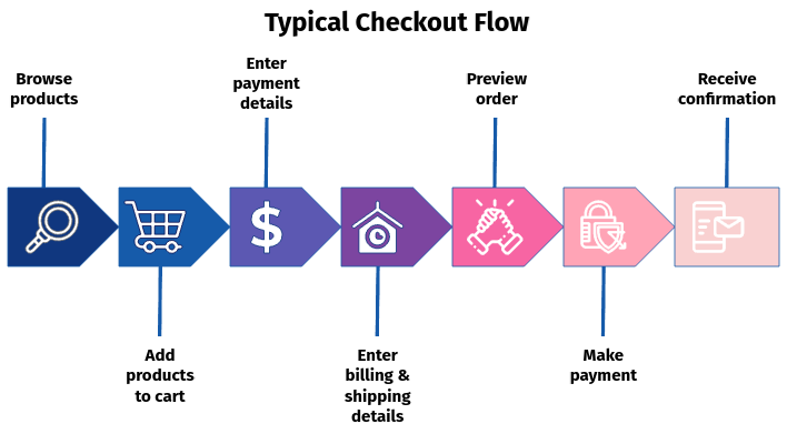
Image source: Jimmy Rodriguez, COO of Shift4Shop (September 14, 2021)
The goal of your checkout flow is to encourage customers to complete their purchases and gain opportunities for repeat customers through gathering information like email addresses. Giving customers the ability to enter their email addresses allows them to sign up for future marketing emails and gives them easy access to their tracking information. And, as our research shows, 42% of customers are looking for daily shipping updates, even if there aren’t any major tracking updates.
Cart abandonment vs checkout abandonment
Cart abandonment and checkout abandonment are sometimes used interchangeably. However, the difference between the two lies in where a customer leaves your site without completing a purchase. Cart abandonment occurs when a customer leaves a site after adding products to their cart. On the other hand, checkout abandonment occurs when a customer enters their billing information and/or previews the orders and then leaves a website.
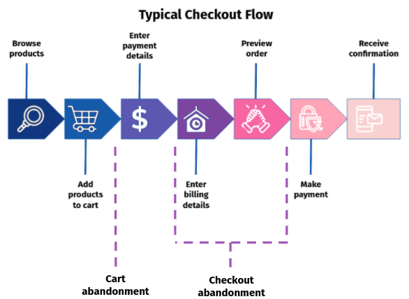
Image source: Jimmy Rodriguez, COO of Shift4Shop (September 14, 2021)
7 tricks to create a better checkout experience
Knowing the difference between cart and checkout abandonment is crucial because it helps identify where and why customers aren’t completing their purchases. These 7 tips are designed to help with both types of abandonment and create the best customer experience. Boosted sales and heightened customer satisfaction await!
#1 Don’t hide the cost
Be transparent about shipping costs, taxes, and other fees as soon as possible. In fact, 48% of customers are more likely to abandon an order because of last-minute fees. Make a banner for the top of your website to showcase free shipping or a free shipping threshold. Additionally, show the total cost whenever customers create their cart to avoid miscommunication.
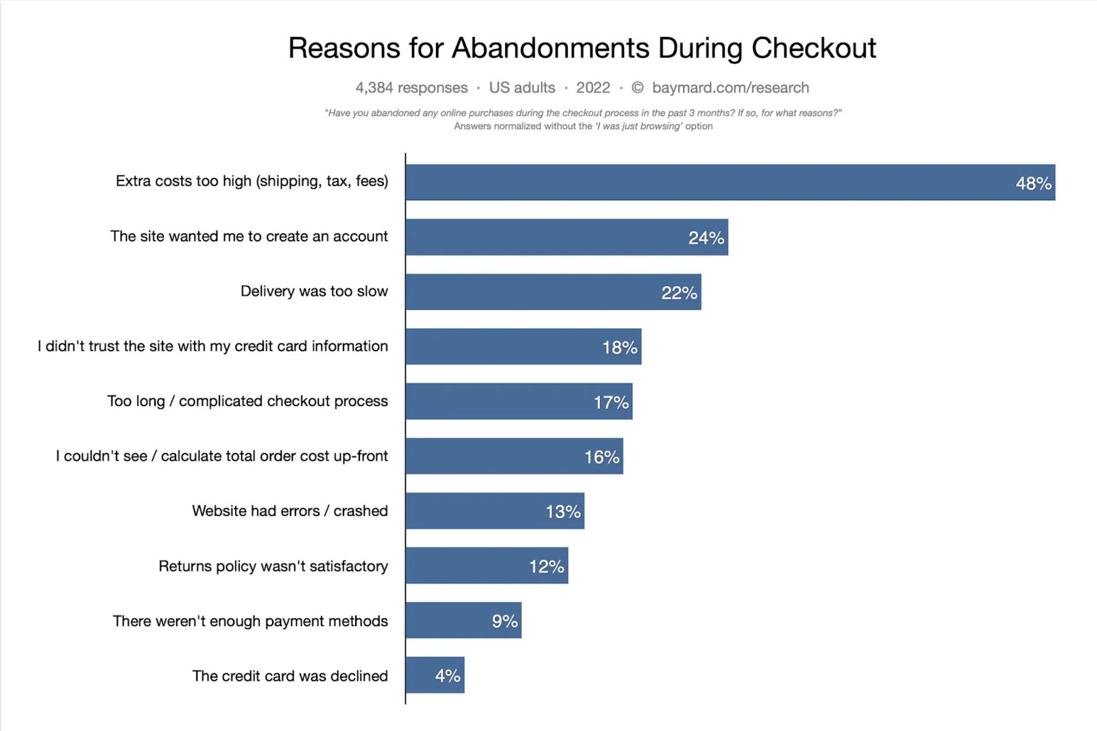
Image source: Baymard Institute
#2 Check your website’s performance
Imagine seeing an ad for a really cool product, only to find the website doesn’t load or doesn’t have a stable connection. You’d be less likely to click on an ad for the same business in the future, right? Regularly check your website’s performance to avoid losing customers. Free resources like Google Pagespeed Insights can save you major headaches down the road. Identifying the problem(s) now will decrease the likelihood of crashes during the holiday season.
#3 Provide guest checkout options
Don’t make your customers create an account before checkout; this option only leads to additional clicks, meaning an uptick in cart or checkout abandonment. Let customers choose whether or not to sign up or check out as a guest. If a customer is in a hurry, they’ll appreciate the faster option.
#4 Decrease clicks and increase payment options
We live in a fast-paced society. And, oftentimes, customers don’t want to enter full card information to complete a transaction. Consider adding payment options like Apple Pay and PayPal, so customers can pay through touch IDs or logging into a digital wallet. If your business is able, it’s also worth looking into a mobile app and updating the mobile version of your website. This way, customers can easily access your store and save their preferences for future purchases, creating an easier checkout experience.
Additionally, offering options like Klarna and Afterpay give customers the ability to break purchases down into payments. These options will make it more likely for customers to complete purchases on more expensive items because they don’t have to pay the full cost upfront.
#5 Add trust badges to your website
Unfortunately, ecommerce scams and fraud are still common. Customers purchase from stores and either never receive their orders or receive items that are completely different from how they were shown. Let customers know they can trust your business, and include trust badges on your website. Some recommended trust badges include:
- Money-back and returns guarantee: Adding badges to the checkout pages that remind customers you offer free returns and/or a money-back guarantee is a great way to reassure them while making their purchase.
- Free shipping: A free shipping badge displayed on your website and at each stage of the checkout flow reassures customers that shipping will be free and they won’t encounter any surprises at checkout.
- Accepted payments: This badge shows your customers the payment method your site accepts, such as Visa, Mastercard, PayPal, or American Express.
- Third-party endorsements: Third-party endorsement badges show that your business is credible. The Better Business Bureau Accredited Business and Google Customer Review badges are both trustworthy badges to add to your ecommerce website.
#6 Send cart and checkout abandonment emails
Customers want increased communication throughout the shipping process. With an increase in wanted communication, sending emails to customers who have abandoned their orders can help them revisit potential purchases. Also, be creative! Include promotions if customers complete their purchase within a certain time frame and include eye-catching subject lines.
#7 Include auto-save features with your shopping cart
Say you need more time to contemplate a purchase. You finally decide to go for it, only to find your cart has timed out and emptied itself. If you were already on the fence, this could be taken as a sign that you didn’t really need those items. Keep the decision and checkout processes easy for customers and add an auto-save feature. Customers can easily revisit their carts, so they’ll be more likely to complete their purchases moving forward.
Tips for your checkout process
- Don’t make customers create accounts
- Check your website performance regularly
- Add trust badges to build trust with customers
- Include payment plan offerings like Klarna and Afterpay
- Be open about shipping costs and additional fees upfront
- Streamline the checkout process with offerings like Apple Pay and PayPal
